

ORANGE CITY, Iowa -- Challenging times call for colors, and lots of them.
So much so that Diamond Vogel, the Orange City-based maker of paints, decided this year, for the first time, to highlight not one Color of the Year, but a group of four "Feature Colors" in its annual Color Trends Report.
"The theme this year was 'Momentum to New Beginnings,'" said Sandy Agar-Studelska, marketing manager at Diamond Vogel. "There's certainly a lot of pressure that all of us have -- including families and homeowners -- with the economy and inflation and things like that.
"We're always looking for new ways to express ourselves. And we might not always be able to do that on the exterior of our home with color, but we can certainly do it within our home," she added.
Diamond Vogel's Feature Colors for this year are:
People are also reading…
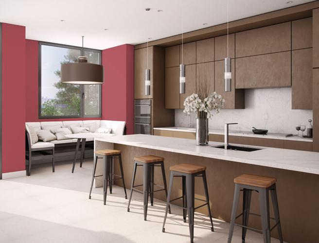
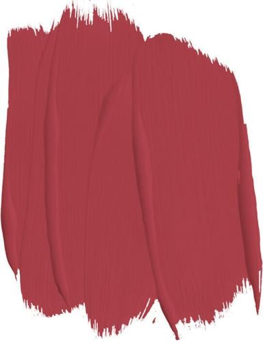
- Moonrose, described in the Color Trends Report as a "spirited" shade of red that delivers "a spark of modern energy and optimism."
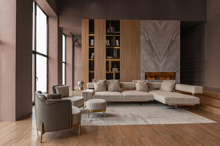
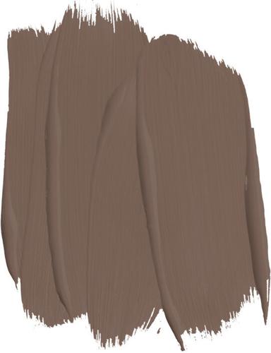
- Ranch House, a "deep brown" that "pairs well with earth-inspired accents to create a feeling of strength and reflection."
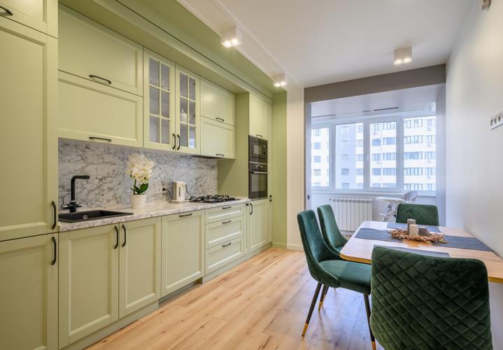
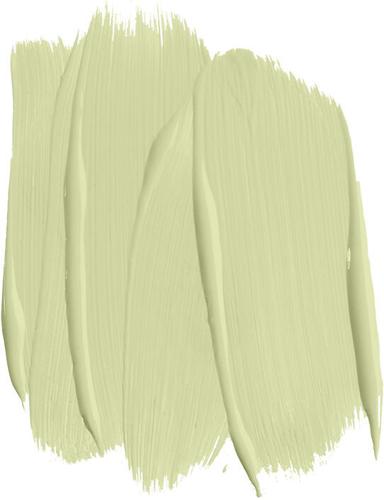
- Fresh Start, "an upbeat green that delivers energy and youthful fun."
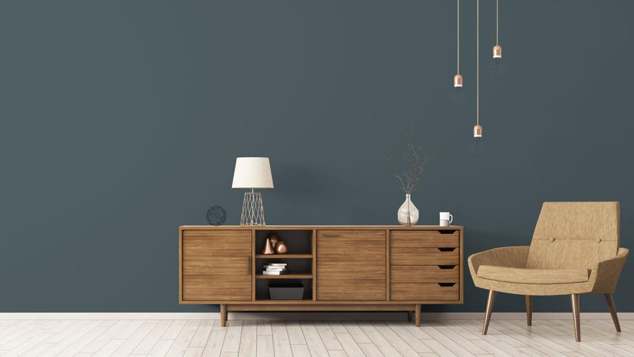
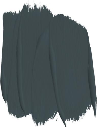
- Calm Interlude, "an ultra-deep blue green," a shade described in the Color Report as "classic and calming yet modern." Blue colors have in recent years reigned supreme among Diamond Vogel's Color of the Year picks -- between 2018 and 2022, only once did the Color of the Year not fall somewhere in the blue or blue-ish spectrum.

None of these colors is a loner. Diamond Vogel grouped each of them with their own color families -- or palettes -- consisting of four additional colors suggested to pair well with the main Feature Color. The Moonrose palette, for instance, includes Thistle Gray (a gray color), Summer Beige (a pink-ish shade), Elusive White (a "warm" white) and Stony Field (a dark brown-ish color).
Each of the Feature Colors is relatively intense; for that reason, Agar-Studelska said, they work well as accents -- used to paint a single wall, for instance. Ideally that wouldn't be a wall that already has a lot going on (so, not the wall that the big TV is affixed to, nor the wall festooned with art).
Though they're largely intended for the interior, the daring could try the Feature Colors as accents for the exterior -- a door could be painted with Fresh Start, for instance, or the shutters could be painted with Ranch House.
"They pair so nicely, too, with those that have a lot of gray in their home, because we have come off a time of a lot of gray being use," she said. "But (the Feature Colors) also pair fantastically with these warm or neutral colors, like browns and beiges and taupes."

Shades of white and gray were, for a number of years, predominant choices for neutral colors -- which are the principal colors in most modern interiors, as they're thought to make a space both brighter and seemingly larger, and because they don't clash with the décor. Put more simply, they're inoffensive. By the same token, stronger colors tend to be used sparingly.
But, for neutrals, the pendulum has swung away from whites and grays, toward somewhat warmer hues. Diamond Vogel's suggested color palette to complement Ranch House, for instance, includes two greenish shades, a very warm terracotta color and a beige or cream-ish color, while the Fresh Start palette includes an intense pink-ish shade, two blues and a parchment color.
"Overall I would characterize the color movement right now as warmer," Agar-Studelska said. "In that, there's going to be more of your browns, even a little bit more into yellows. But certainly for neutrals, we do see that trend moving away from more stark grays, with a lot more warmness to them. And seeing a lot of the browns and the taupes and beiges being used. And I really think that's just an extension of us just wanting to find comfort in our homes. And most colors do tend to cycle about every 10, 15 years."